ux Design
Featured Project
Fuse LXP Redesign
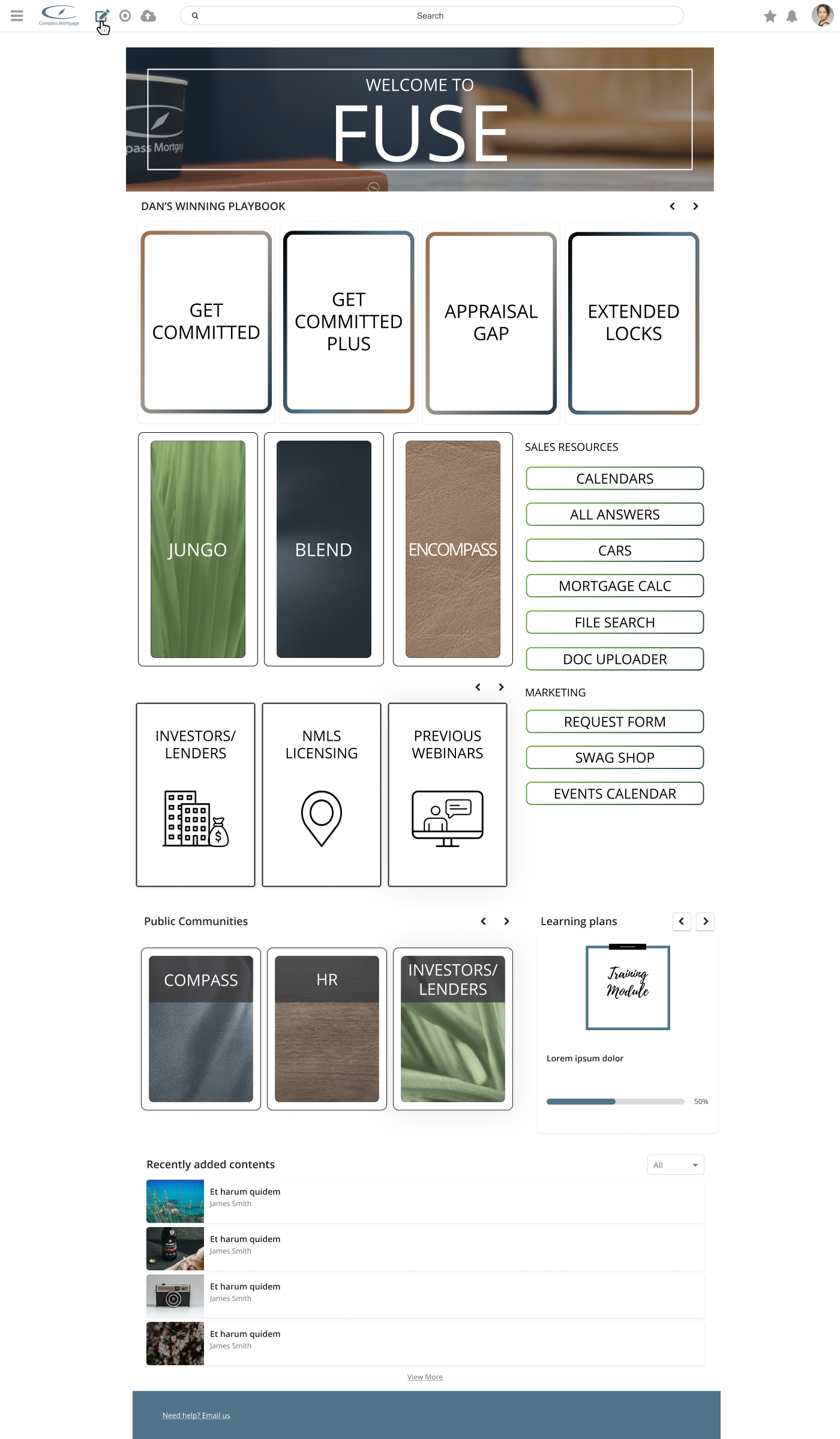
After months of acquiring and publishing content in Fuse, it was noticed that users were having difficulty finding the educational resources they needed. As such, it was decided that a redesign of the platform needed to happen to help users’ experiences when looking for content in the flow of work.

When it came to analyzing the users’ needs and their journey, open communication was key. After discussions with Sr. Management and SMEs, we identified that the priority of main users accessing the platform was the sales team, as they needed the quickest access to the most resources.
After identifying the audience, it was key to speak with the Sales audience to understand what they were looking for on the platform, and how they were navigating it.
Tracking their journey and gathering their feedback was an exciting process that garnered much movement for the design phase of the process.
rThe design phase was a tricky element on it’s own. The Fuse LXP platform has a limited widget structure, so being able to design pages that had everything the Sales team needed was a task of its own.
In addition to the widget layout of the pages, the current platform brand was non-cohesive and needed to be redesigned as well.
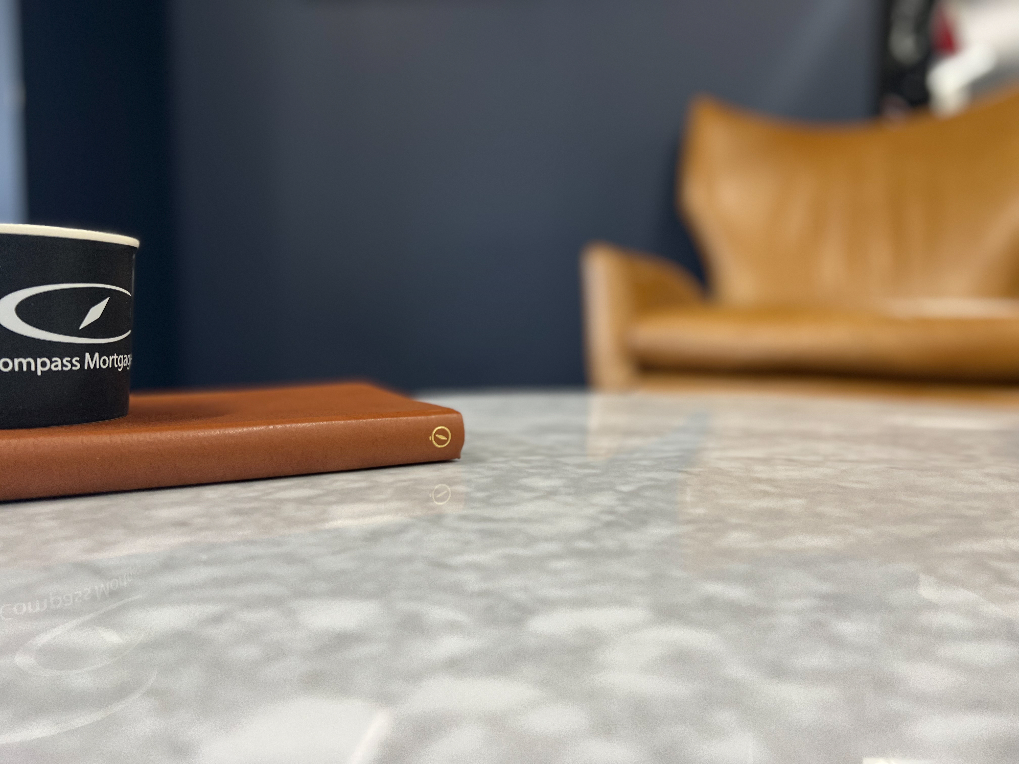
After talks with Sr. Management, I came up with an idea to rebrand the platform to look like the Corporate HQ office. The reasoning for this was that many employees were working mostly in remote and hybrid environments, and culturally we wanted people to feel “together” in the office, so this platform would give off that particular vibe of being back in the office.
To help with this, I organized and completed a photoshoot of different areas of the office and the different textures and fabrics found in the office. Images of in-office locations would be used for banners, headers, and backgrounds for course designs, while textures and fabrics would be used for button and static link backdrops.
After creating a handful of prototypes using Figma, I completed some A/B testing with select members of the Sales team and gathered feedback on which versions they preferred within their user journey. I then took that feedback and made corrections to the design, which was then approved for development.
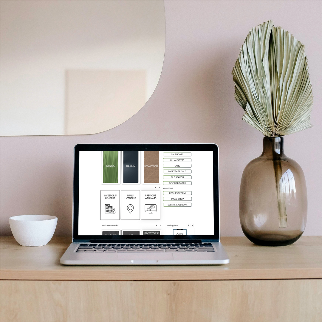
Taking the designs and developing them inside the platform took a lot of hard work, but was worth it in the end.
One area that became a small hiccup was the amount of custom html/css coding I needed to do in order to get the designs to work in the platform based on the limited widget structure that Fuse has.
After building out a myriad of custom widgets to support the design and user needs, the full development was complete and users could begin to use the platform.
Implementation of this new platform layout to the Sales team was completed through a series of announcements, short video tutorials, and live trainings.
Via this series, I showed the Sales team how each of the new pages were organized, how they could find items, and described best practices for them. After that, I had them take turns and navigate the platform to find items they were looking for and gave them the opportunity to ask me any clarifying questions.
After the initial implementation and rollout of the new redesign, I conducted a series of surveys and live feedback with the Sales team to continue to improve their experience.
After these evaluations, we recognized that one additional static link element was needed on one of the pages so as to enhance their experience and provide ease in their search.
I continue to monitor these new pages and gather feedback as I work on identifying other user journeys and redesigning additional platform pages to fit their needs.
DESIGN PROCESS
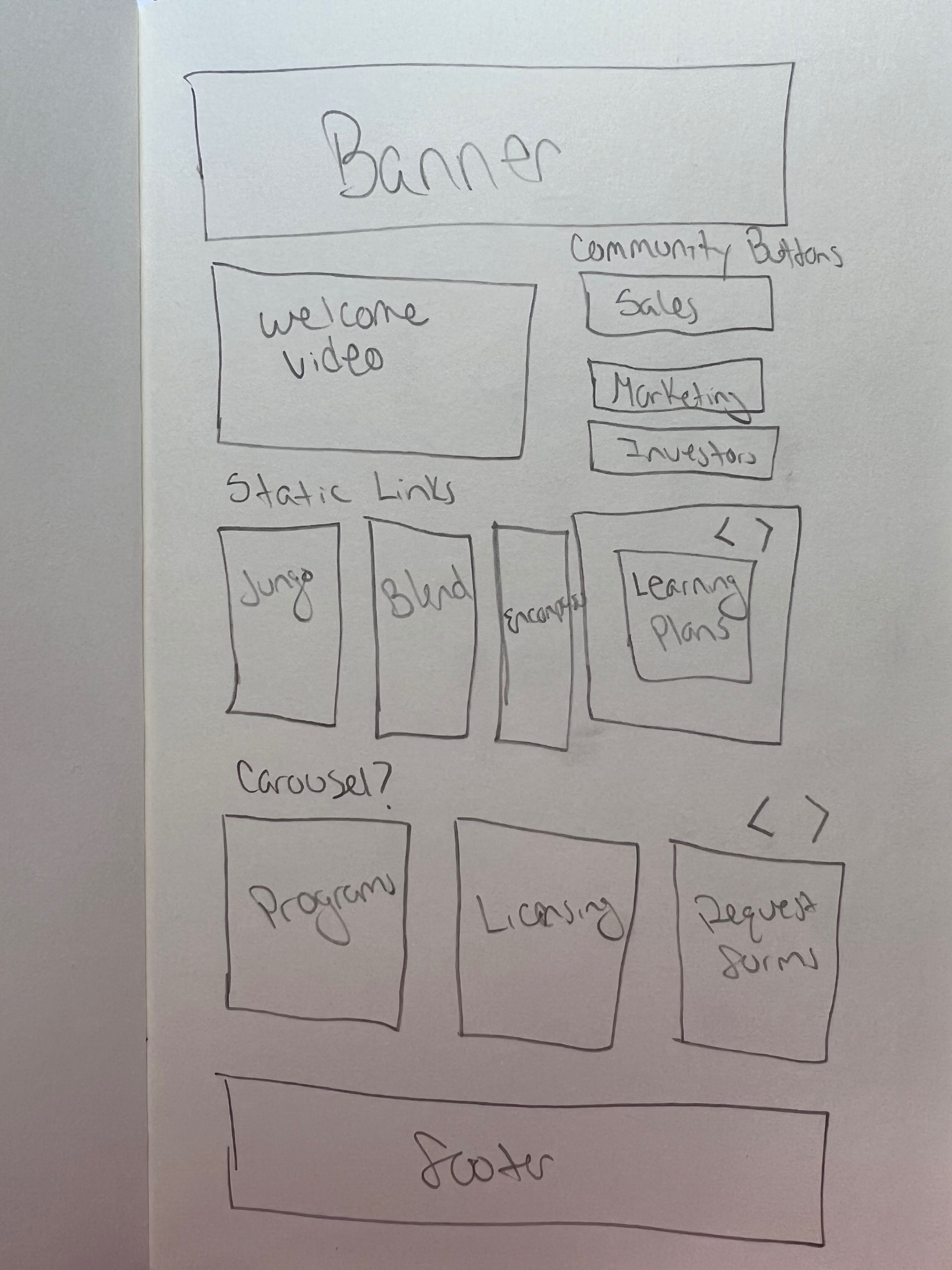
SKETCH – SALES PAGE LAYOUT
OFFICE PHOTOSHOOT

PROTOTYPE DRAFT
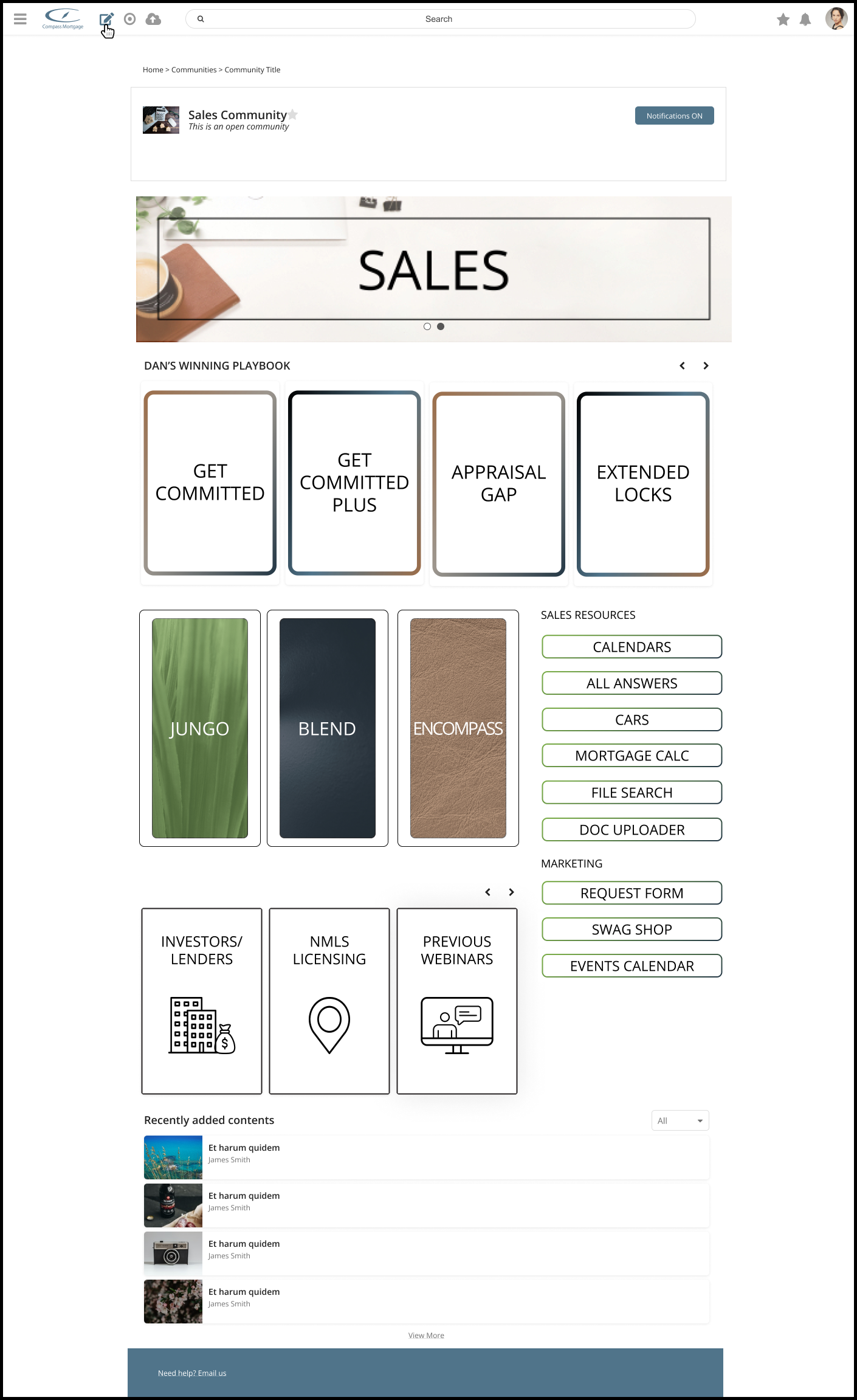
FINAL DELIVERABLE
